Huge inc.
Scaling a New Brand System at Huge
Client
Huge
Year
2022
Services
Design Systems
Brand Identity
Presentation Design
Info
Founded in Brooklyn, Huge had built its identity around a very specific local context — a beloved brand, but one designed for where the agency was, not where it was going. As Huge set its sights on a more global footprint, that local foundation became a systems problem. Across 8 global office hubs, each had developed its own regional interpretation of the brand, and there was no single, scalable way for 1,500+ employees to show up consistently. Working alongside Huge’s Global Executive Design Principal during concepting, my focus was on identifying which elements of the emerging identity would need to scale — and designing the systems, templates, and standards that would carry them across every hub from launch onward, ready to perform in real situations already in motion: pitches, leadership communications, and the steady volume of internal work that would follow.
How the brand was designed to operate
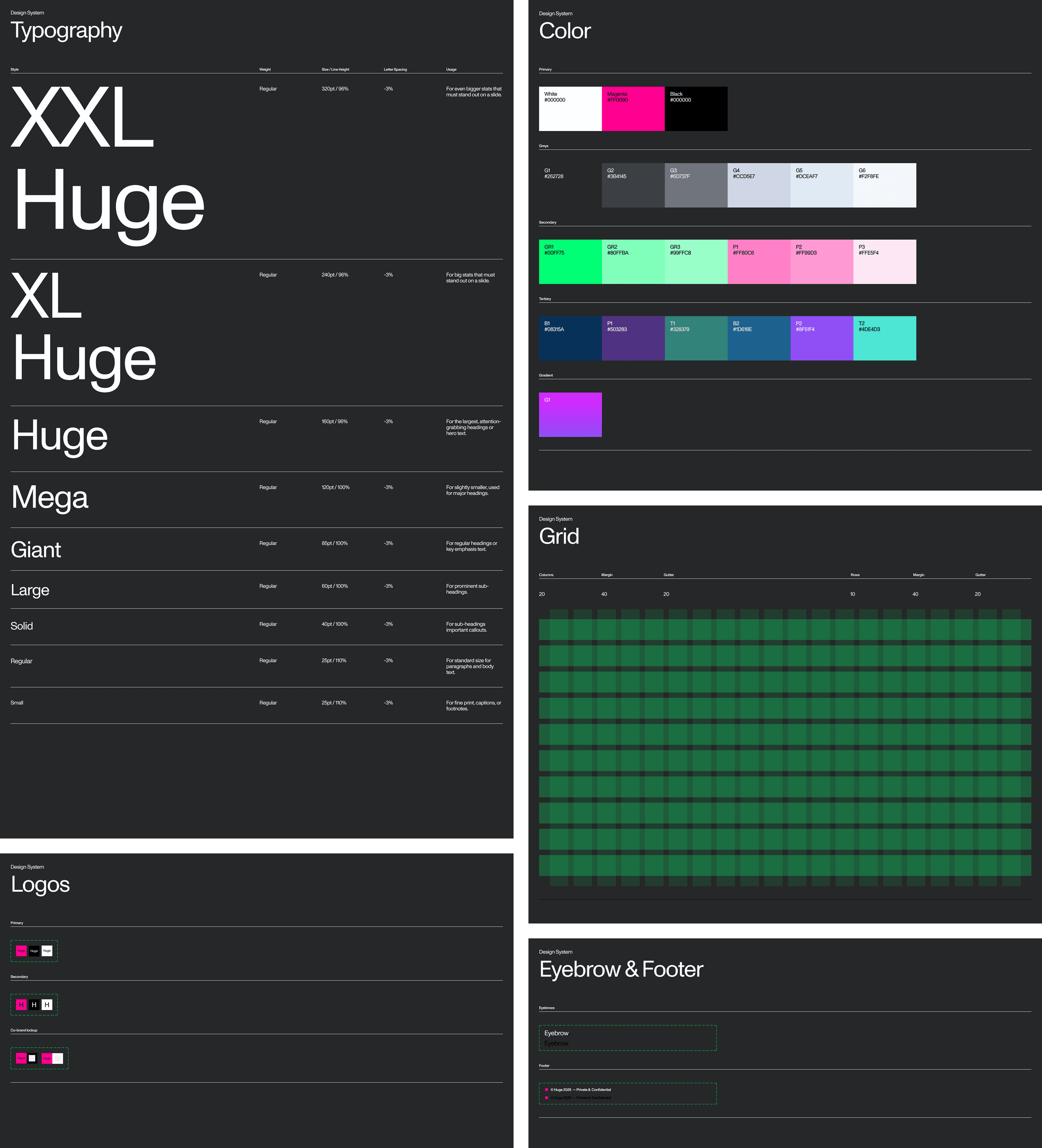
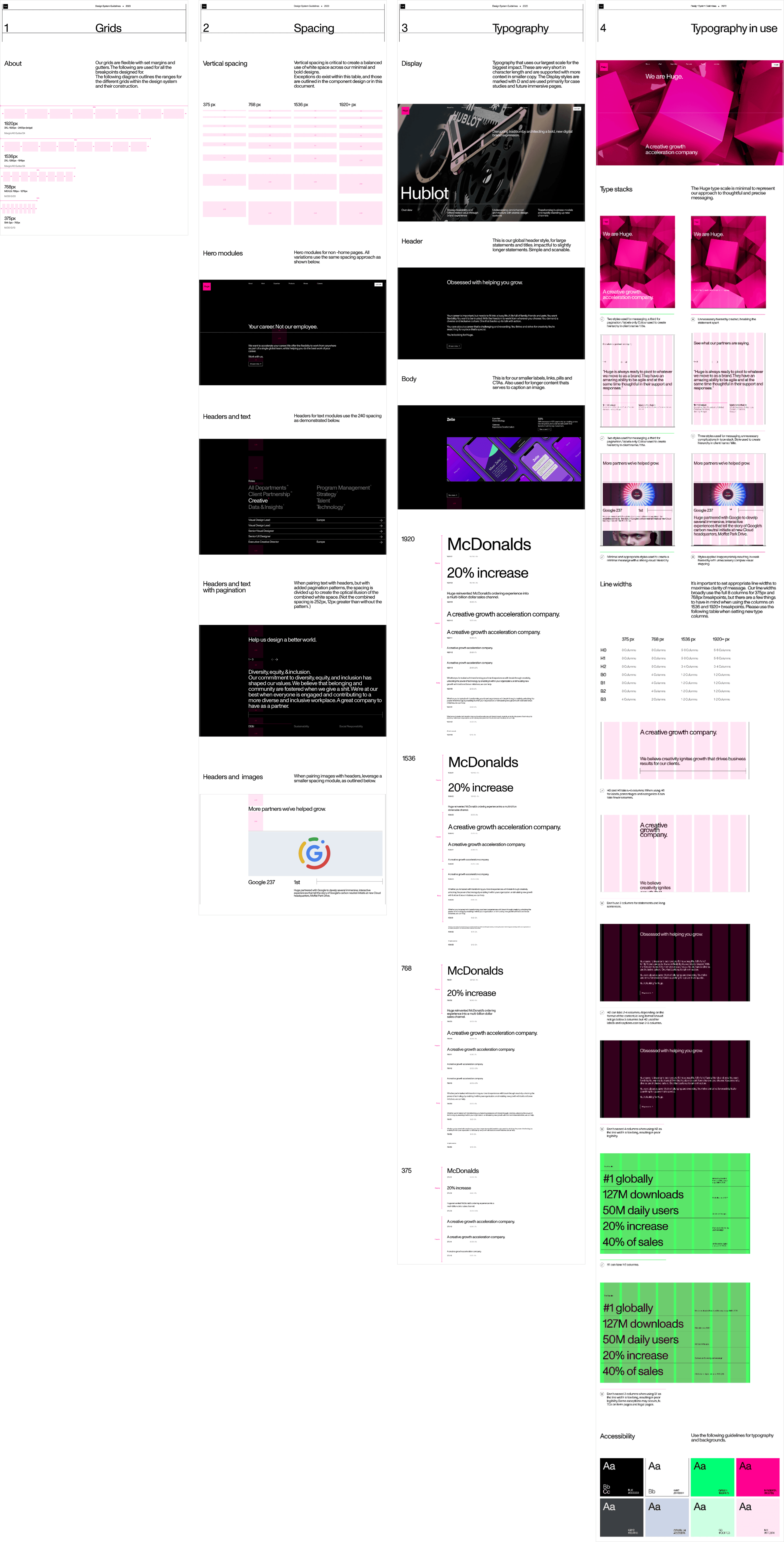
A core part of our concepting was treating the rebrand as a system that could perform under pressure, not just as a visual identity. Structure, hierarchy, spacing, and proportion were treated as core brand decisions so the work could support high-stakes new business pitches, leadership moments, and full-funnel marketing without losing clarity or polish.
These foundations gave teams a shared visual logic that held up in client-facing and externally visible work, allowing the brand to present with confidence and consistency even as content, contributors, and contexts shifted. But foundations alone weren’t enough — they needed to be enforced where the work actually happened.
Guardrails that shaped everyday use
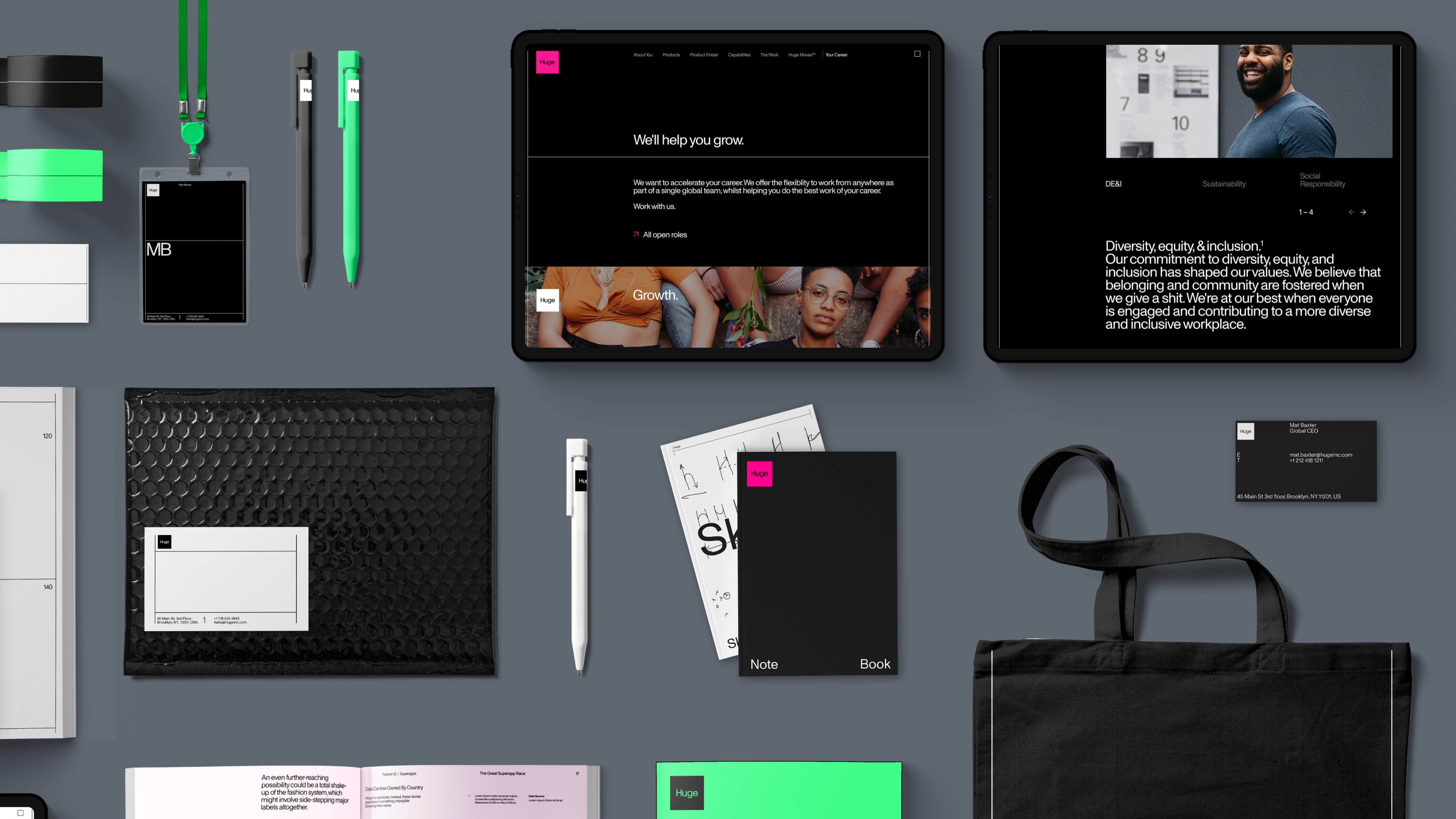
To make those foundations hold under real conditions, guardrails were embedded directly into the tools teams used every day. The system extended across Figma, Keynote, PowerPoint, Google Slides, and Adobe production files, with templates spanning pitch decks, leadership communications, case studies, and internal comms. Core layout regions such as headers, content areas, and data modules were designed as structured, reusable elements that enforced spacing, alignment, and hierarchy by default. Approved layout states guided correct usage while still allowing flexibility. As more contributors began working within the system, these guardrails helped the brand hold together without constant intervention.
Templates in production
Where guardrails kept the system intact, templates carried it outward. They functioned as the most visible expression of the rebrand, carrying the identity into new business pitches, client work, leadership moments, and ongoing delivery. By grounding templates in the underlying system, the brand could be deployed quickly and consistently wherever it needed to perform.
Outcomes
01
Defined how the rebrand showed up in high-visibility and everyday work.
02
Built production-ready systems and templates deployed across 8 global office hubs and 1,500+ employees.
03
Improved clarity and consistency across client-facing and recurring materials.
04
Enabled faster delivery without compromising structure or clarity of messaging.
